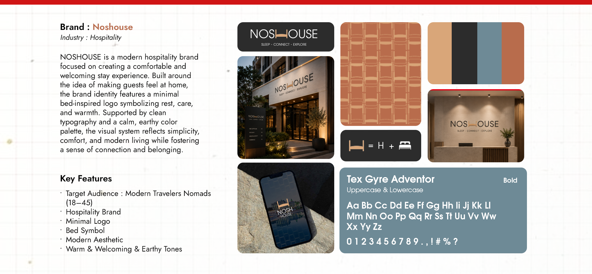
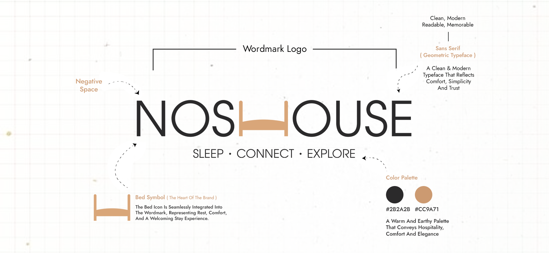
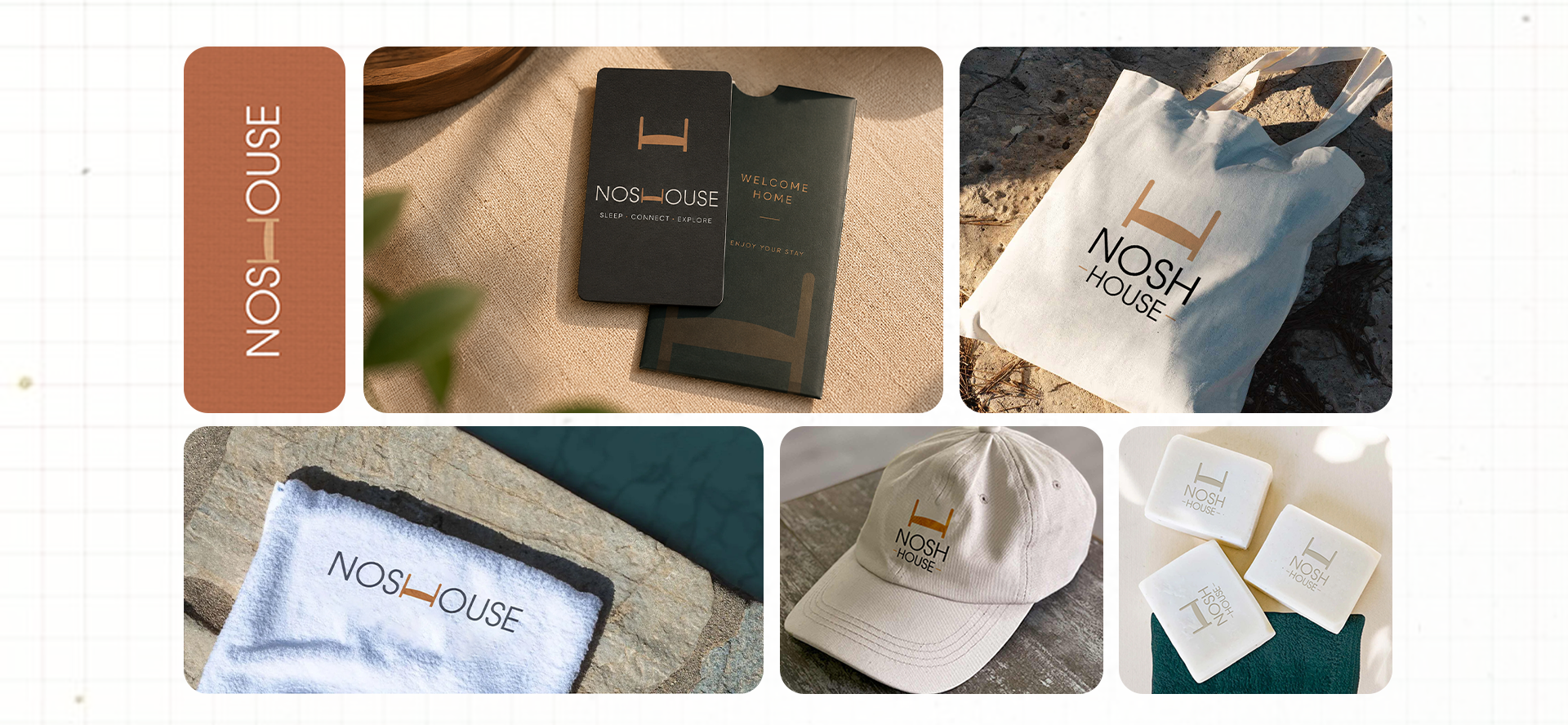
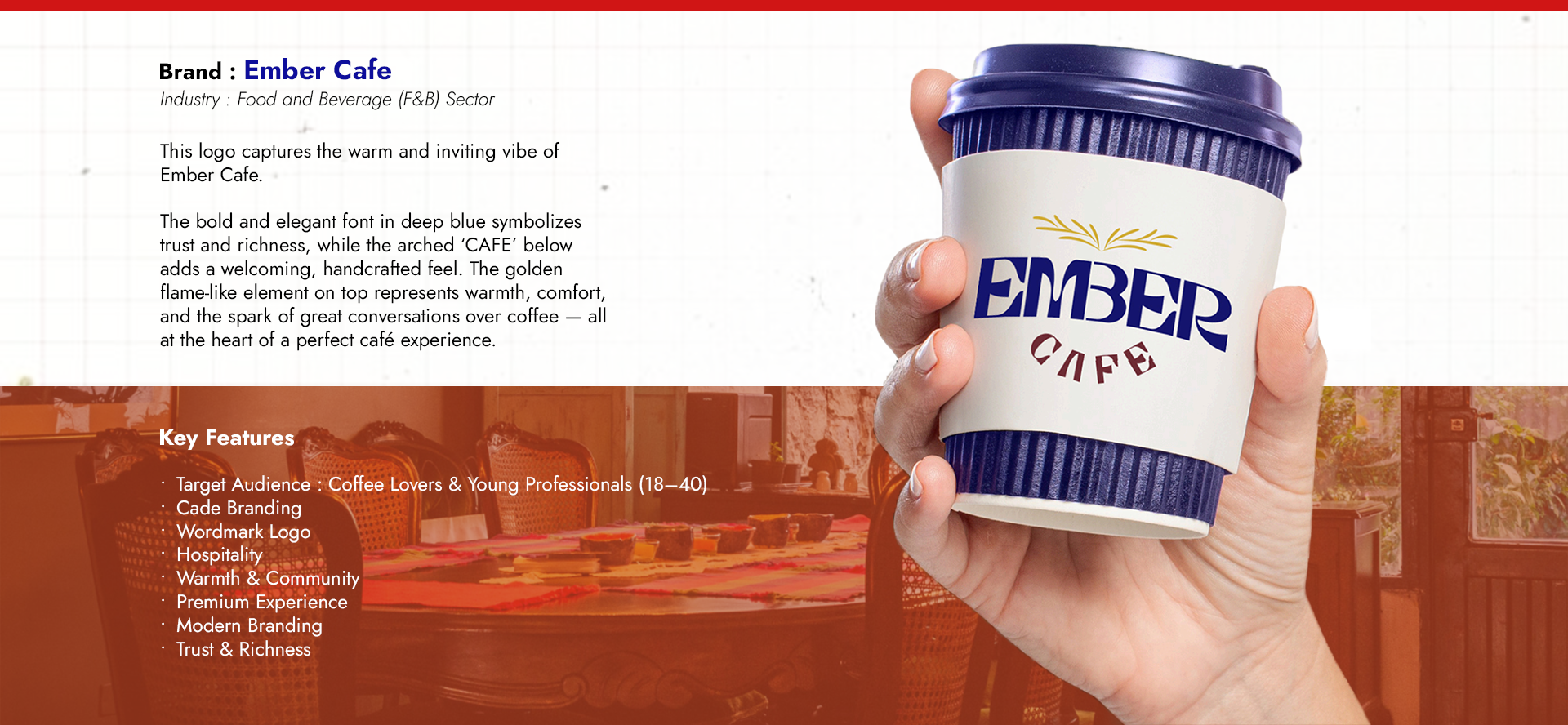
Hello...
I am a passionate Graphic Designer and Video Editor with strong expertise in the Adobe Creative Suite, including Photoshop, Illustrator, Premiere Pro, After Effects, XD, Figma, and InDesign. I specialize in transforming ideas into visually compelling designs that communicate clearly and leave a lasting impact.
With a strong foundation in brand identity design, promotional creatives, and engaging video content, I focus on creating visuals that not only look aesthetically powerful but also align with brand strategy and audience psychology. My approach blends creativity, storytelling, and precision, ensuring every design serves a clear purpose.
I am driven by the belief that great design goes beyond visuals—it builds trust, enhances brand presence, and creates meaningful connections with people. Whether it’s crafting a brand from scratch or elevating existing visuals, I strive to deliver work that is professional, impactful, and results-oriented.
Experience &
Education
Trainer & Editor
Jan 2024 – Present | Global Institute Of Computer Technologies – GICT
Graphic Designer & Video Editor
May 2023 – Jan 2024 | Global Institute Of Computer Technologies – GICT
Intern Graphic Designer & Video Editor
Oct 2022 – Mar 2023 | Lingaya’s Vidyapeeth University
Bachelor Of Design (B.Des)
Specialised in Graphic Design
Education &
Experience
Trainer & Editor
Global Institute Of Computer Technologies – GICT | Jan 2024 – Present
Graphic Designer & Video Editor
Global Institute Of Computer Technologies – GICT | May 2023 – Jan 2024
Intern Graphic Designer & Video Editor
Lingaya’s Vidyapeeth University | Oct 2022 – Mar 2023
Bachelor Of Design (B.Des)
Specialised in Graphic Design


Design That Connects
Design is more than aesthetics—it’s communication with purpose. I create visual experiences that connect brands with their audience through clarity, emotion, and strategy. Every design is thoughtfully crafted to tell a story, build trust, and leave a lasting impression.
From brand identities to digital creatives and video content, my focus is on delivering designs that feel meaningful, relevant, and impactful.


NOSHOUSE is a modern hospitality brand built around one simple idea — making people feel at home, wherever they go.
Today, travelers look for more than just a place to stay. They seek comfort, connection, and a sense of belonging. NOSHOUSE is designed to offer a calm and welcoming space where rest feels natural and every stay feels personal. The brand identity features a minimal bed symbol seamlessly integrated into the logo, representing rest, care, and warmth — the heart of every meaningful stay. The visual language uses soft, earthy colors and clean typography to create a peaceful, modern, and timeless feel. NOSHOUSE is more than accommodation. It’s about slowing down, feeling connected, and enjoying the journey — with comfort at its core.
NOSHOUSE is a modern hospitality brand built around one simple idea — making people feel at home, wherever they go.
Today, travelers look for more than just a place to stay. They seek comfort, connection, and a sense of belonging. NOSHOUSE is designed to offer a calm and welcoming space where rest feels natural and every stay feels personal.
The brand identity features a minimal bed symbol seamlessly integrated into the logo, representing rest, care, and warmth — the heart of every meaningful stay. The visual language uses soft, earthy colors and clean typography to create a peaceful, modern, and timeless feel.
NOSHOUSE is more than accommodation.
It’s about slowing down, feeling connected, and enjoying the journey — with comfort at its core.


EMBER CAFE
Ember Cafe is a warm and welcoming cafe brand built around rich flavors and cozy experiences. The identity reflects comfort, quality, and a relaxed atmosphere where people come together to enjoy good food, great coffee, and meaningful moments.
FLUXPRO
FluxPro is a high-performance fitness brand delivering sportswear and accessories designed for strength, comfort, and movement. Built for those who push limits and stay active.
BIRYANI BROTHERS
Biryani Brothers is a food brand rooted in tradition and rich Indian flavors. The identity blends cultural elements with a modern touch, representing authenticity, togetherness, and the joy of sharing delicious biryani made with care.
ZENITH TECH SOLUTIONS
Zenith Tech Solutions is an IT services company focused on building reliable, scalable, and modern digital solutions. From technology strategy to execution, the brand represents innovation, connectivity, and growth in the digital world.
NOURSIH DELIGHTS COOKIES
Nourish Delights Cookies is a food brand that blends taste, warmth, and happiness in every bite. Designed to feel friendly and joyful, the brand reflects freshness, quality ingredients, and the comfort of homemade treats.
DESIGN JUNCTION
Design Junction is a creative design institute and studio where ideas take shape through strong visual communication. The brand stands for creativity, learning, and direction, helping individuals and brands turn concepts into impactful designs.
PureGlam
PureGlam is a modern cosmetic brand that celebrates beauty in its most elegant and confident form. The identity blends purity with glamour, reflecting sophistication, self-expression, and timeless style designed for modern individuals.
Aurora Bloom
Aurora Bloom is a floral brand inspired by nature’s beauty and fresh beginnings. The brand represents elegance, freshness, and emotion, offering thoughtfully designed floral creations that bring warmth, joy, and natural charm to every moment.
NOSHOUSE
NOSHOUSE is a modern hospitality brand built around comfort, care, and a sense of home. Designed to feel warm and welcoming, the brand focuses on creating calm spaces where rest feels natural and every stay feels personal.


ECO FEAST - DRY FRUIT
Eco Feast is a premium dry fruit packaging concept designed to reflect purity, quality, and natural richness. The visual identity is built around earthy tones that directly represent the product category — green for Pistachio, warm brown for Walnut, and rich almond brown for Almond. The design balances elegance and clarity.
A serif logotype adds a premium and trustworthy feel, while the minimal layout ensures strong shelf visibility. The curved beige section at the bottom creates a soft, organic flow — symbolizing natural goodness.
Each variant maintains strong brand consistency while using color differentiation to ensure easy product recognition. High-quality nut imagery enhances appetite appeal and instantly communicates freshness. The packaging features a clear product hierarchy with a strong brand presence, along with color-coded variants for quick identification. Premium typography with a natural aesthetic adds to the overall appeal, while trust-building elements such as quality seals and feature icons reinforce credibility. A clean, modern layout makes it suitable for retail shelves. This project reflects my approach to packaging design—blending branding, strategy, and visual storytelling to create designs that not only look premium but also effectively communicate value.
The packaging concept of GORX Energy Drink revolves around strength, royalty, and electrifying performance. The crowned gorilla represents leadership and dominance, while the blue lightning visually communicates instant energy and high performance. The bold blue typography contrasts against the dark background to create a premium, aggressive, and high-impact shelf presence. The design targets athletes, gamers, and go-getters who need clean, powerful energy when it matters most.
Each variant maintains strong brand consistency while using color differentiation to ensure easy product recognition. High-quality nut imagery enhances appetite appeal and instantly communicates freshness. The packaging features a clear product hierarchy with a strong brand presence, along with color-coded variants for quick identification.
Premium typography with a natural aesthetic adds to the overall appeal, while trust-building elements such as quality seals and feature icons reinforce credibility. A clean, modern layout makes it suitable for retail shelves. This project reflects my approach to packaging design—blending branding, strategy, and visual storytelling to create designs that not only look premium but also effectively communicate value.
The packaging concept of GORX Energy Drink revolves around strength, royalty, and electrifying performance. The crowned gorilla represents leadership and dominance, while the blue lightning visually communicates instant energy and high performance. The bold blue typography contrasts against the dark background to create a premium, aggressive, and high-impact shelf presence. The design targets athletes, gamers, and go-getters who need clean, powerful energy when it matters most.


Redesigning - India Post Mobile App
Improving Usability, Visual Hierarchy & Modern Experience
India Post is the government-operated postal system under the Ministry of Communications, serving millions across India including rural populations.
The mobile banking app is designed to provide digital access to postal banking services.
Problem Statement:
The existing India Post mobile banking app suffers from outdated visual design, poor information hierarchy, and complex navigation, making it difficult for users — especially elderly and rural users — to complete basic banking tasks efficiently.
This redesign focuses on:
Login Experience | Dashboard | Accounts Overview | Payments | Cheque Services | Time Deposit Opening Flow | Other backend systems and advanced features were not redesigned.
Existing Screens:
Visual Hierarchy Issues
Users struggle to focus on primary actions, Large top branding area consuming space.
Navigation Problems
Top horizontal navigation bar: Home | Accounts | Transfers | Payments | Cheques
Inconsistent UI Components
This creates cognitive overload, Forms lack proper spacing.
Accessibility Issues
Small text size, Dense transaction tables, Not optimized for elderly users.
Reimagining the Interface